The Evolution of User Interfaces
UI design tends to move like a pendulum. When a new platform matures, designers lean on familiar metaphors; when users become fluent, we simplify; when simplicity becomes ambiguous, we reintroduce cues.
Over the last decade we saw:
- Skeuomorphism: interfaces mimicked physical objects to reduce cognitive load (early iOS, leather textures, shadows, knobs).
- Flat design: removed most ornamentation to improve clarity and performance and to support responsive layouts.
- Material and “depth-aware” systems: reintroduced elevation, motion, and hierarchy, but in a more systematic way.
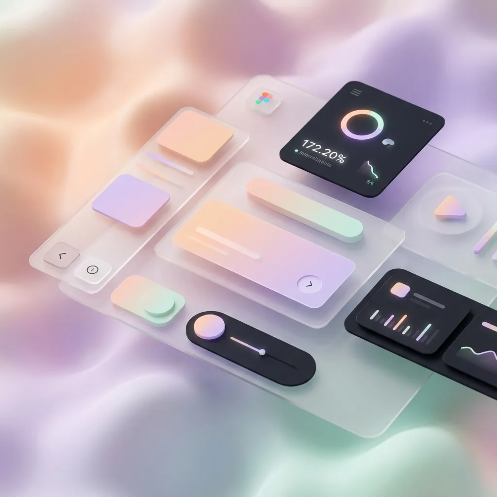
Today, two visual styles—Neumorphism and Glassmorphism—often get labeled as “the future.” The useful framing is more nuanced:
- They’re not universal solutions.
- They are signals that depth, hierarchy, and context matter again.
The real future is not a single aesthetic. It’s interfaces that communicate clearly and adapt gracefully across devices, inputs, and user needs.
Why Depth Matters (Beyond Looking Fancy)
When everything looks equally clickable, users hesitate. They scan longer, make more mistakes, and rely on trial-and-error.
Depth is a tool for communication. It provides quick cues:
- Raised / floating: likely interactive or primary.
- Inset / sunken: pressed, selected, or a container.
- Flat: content, not a control.
But depth is not only shadows. You can signal hierarchy using:
- Spacing: larger gaps around groups create structure.
- Typography: weight, size, and line-height create scannability.
- Color and contrast: separates layers and focuses attention.
- Motion: subtle transitions can communicate state changes.
- Shape: rounding, borders, and dividers can imply affordance.
Good modern UI uses depth sparingly and intentionally—like punctuation.
Neumorphism: Soft Depth With Sharp Tradeoffs
Neumorphism (“Soft UI”) creates an element that looks extruded from the background. It does this by placing a light shadow on one side and a darker shadow on the other, usually on a background color that matches the surface.
It can look elegant, but it has a common failure mode: low contrast.
When Neumorphism Works
Neumorphism tends to work best when:
- the UI is simple and minimal (few components on screen)
- the brand is calm and tactile (health, meditation, audio tools)
- the interface is not information-dense
- you can guarantee strong focus/active states beyond just shadows
Where Neumorphism Usually Fails
Be cautious when:
- your UI contains lots of text and data tables
- you need strong accessibility contrast (WCAG) across components
- you rely on shadows to indicate interaction (shadows are not enough)
Neumorphism often needs additional cues: borders, color accents, clear icons, and robust focus rings.
Practical Guidelines for Neumorphism (Accessible-ish)
- Never use neumorphism as the only affordance. Pair it with iconography, label clarity, and distinct hover/focus states.
- Ensure keyboard focus is obvious. Use
:focus-visibleand a high-contrast ring. - Avoid neumorphic text inputs without borders. Users need a clear boundary for input fields.
- Don’t apply it to long-form reading surfaces. Low-contrast shadows can reduce readability.
Implementing Neumorphism in CSS
You can keep the style but make it more robust by using CSS variables (for theme control) and by defining separate raised/pressed states.
:root {
  --neu-bg: #e0e5ec;
  --neu-radius: 16px;
  --neu-shadow-dark: rgb(163 177 198 / 0.65);
  --neu-shadow-light: rgb(255 255 255 / 0.7);
  --focus-ring: #2563eb; /* example */
}

.neu-surface {
  background: var(--neu-bg);
  border-radius: var(--neu-radius);
  box-shadow:
    10px 10px 20px var(--neu-shadow-dark),
    -10px -10px 20px var(--neu-shadow-light);
  transition:
    transform 180ms ease,
    box-shadow 180ms ease;
}

.neu-surface:hover {
  transform: translateY(-2px);
  box-shadow:
    14px 14px 28px var(--neu-shadow-dark),
    -14px -14px 28px var(--neu-shadow-light);
}

.neu-surface:active {
  /* pressed/inset state */
  transform: translateY(0);
  box-shadow:
    inset 8px 8px 16px var(--neu-shadow-dark),
    inset -8px -8px 16px var(--neu-shadow-light);
}

.neu-surface:focus-visible {
  outline: 3px solid var(--focus-ring);
  outline-offset: 3px;
}
This won’t magically solve contrast. It does, however, make states explicit and themeable—an important step toward usability.
Glassmorphism: Beautiful, But Performance-Sensitive
Glassmorphism uses translucent surfaces with background blur to create a “frosted glass” effect. It became popular with modern desktop systems because:
- high-resolution displays can render subtle blur nicely
- the OS often provides blurred surfaces efficiently
- layered UI helps users keep context while multitasking
On the web, blur is possible via backdrop-filter, but it comes with compatibility and performance considerations.
When Glassmorphism Works
- you have a visually rich background that benefits from layering
- you need “panels” that float above content (sidebars, modals, widgets)
- your UI has strong typography and spacing (so readability survives translucency)
Risks to Watch For
- Readability: busy backgrounds can destroy text contrast.
- Performance: heavy blur on large surfaces can be expensive.
- Browser support:
backdrop-filteris widely supported in modern browsers, but you should still provide fallbacks.
Implementing Glassmorphism With a Fallback
.glass {
  border-radius: 16px;
  border: 1px solid rgb(255 255 255 / 0.18);
  box-shadow: 0 10px 30px rgb(0 0 0 / 0.15);

  /* fallback: translucent without blur */
  background: rgb(255 255 255 / 0.18);
}

@supports ((-webkit-backdrop-filter: blur(10px)) or (backdrop-filter: blur(10px))) {
  .glass {
    -webkit-backdrop-filter: blur(10px);
    backdrop-filter: blur(10px);
    background: rgb(255 255 255 / 0.12);
  }
}
For readability, consider:
- adding a subtle tint to the glass background
- increasing font weight/size slightly
- avoiding pure white text on pale glass (or vice versa)
- placing glass on top of backgrounds with controlled noise (not random photos)
Adaptive Interfaces: The Real Future
The most future-proof UI is not the one that follows a trend. It’s the one that adapts.
An adaptive interface respects:
- the device (screen size, resolution, orientation)
- the input method (touch, mouse, keyboard, voice)
- the environment (light conditions, distractions, network quality)
- the user’s preferences and abilities (contrast needs, motion sensitivity)
You’ve already seen the first wave of this as “responsive design.” Adaptive design goes further: it’s responsive + accessible + context-aware.
1) Input-Aware Design
Touch and mouse are different.
- Touch needs larger hit targets and more spacing.
- Mouse can handle denser interfaces and relies on hover.
In CSS, you can respond to input capabilities:
/* devices where hover is not reliable (touch-first) */
@media (hover: none) {
  .tooltip {
    display: none;
  }
  .button {
    padding: 14px 16px;
  }
}

/* coarse pointer (finger) */
@media (pointer: coarse) {
  .icon-button {
    min-width: 44px;
    min-height: 44px;
  }
}
2) Preference-Aware Design (Dark Mode, Motion, Contrast)
Modern platforms expose user preferences because “one-size-fits-all” is often harmful.
@media (prefers-color-scheme: dark) {
  :root {
    --bg: #0b1220;
    --text: #e5e7eb;
  }
}

@media (prefers-reduced-motion: reduce) {
  * {
    animation: none !important;
    transition: none !important;
  }
}

@media (prefers-contrast: more) {
  :root {
    --border: #ffffff;
  }
}
If you treat these as “nice-to-have,” your UI will feel outdated. If you treat them as first-class, you build trust.
3) Accessibility as a Design Constraint (Not a Checklist)
If you want your interface to survive new devices and platforms, anchor it in fundamentals:
- clear hierarchy
- semantic structure
- visible focus
- strong contrast
- predictable navigation
Trends change. Accessibility fundamentals don’t.
Neumorphism and glassmorphism can be compatible with accessibility—but only if you avoid the usual mistakes:
- relying on subtle shadows for buttons
- hiding focus rings
- using low-contrast text on translucent surfaces
4) Performance-Aware Visuals
Future interfaces have to run on everything from high-end desktops to budget phones.
Some effects are expensive:
- large blurred surfaces
- multiple layered shadows
- heavy, continuous animations
To keep UI fast:
- animate opacity and transform more than layout
- limit blur radius and blurred area
- reuse component shadows (design tokens help)
- prefer subtle depth with spacing + typography instead of only shadows
Designing for the Next Wave: Systems, Not Screens
What’s changing isn’t just visual style; it’s how interfaces are produced and consumed.
- Design systems are becoming the default. Tokens, components, and documentation bridge design and engineering.
- Variable fonts and responsive typography let you adapt readability to context.
- Container queries make components responsive to their actual container, not just viewport size.
- Multimodal interaction (voice, camera, haptics) is becoming more common.
- Spatial computing introduces depth as a literal axis, not just a visual metaphor.
You don’t need to predict the future to design for it. You need to design in a way that can absorb change.
A Practical Checklist
If you’re building “future-ready” UI, ask:
- Does the core task remain obvious without shadows, blur, or animation?
- Can the interface be used with keyboard only?
- Are focus states visible on every interactive element?
- Can the UI adapt to dark mode and high contrast without redesigning every screen?
- Is text readable on top of translucent surfaces?
- Are touch targets comfortably large on mobile?
- Are expensive effects (blur, deep shadows) used sparingly and tested on low-end devices?
If you can answer “yes,” you’re not just following trends—you’re building interfaces that last.
Closing Thought
Neumorphism and glassmorphism are useful styles when applied intentionally. But the lasting shift is bigger: interfaces are becoming adaptive, inclusive, and context-aware.
Design for clarity first. Use depth as a tool, not decoration. And treat adaptability as the baseline—not the upgrade.